Making Huddles in Slack
easier to schedule
UX
Prototyping
UI
Bootcamp
INTRODUCTION
What is Slack and what are Huddles? 🤷♀️
Slack is a communication platform designed to simplify workplace collaboration through channels, messaging, file sharing, and integrations. One of its features, Slack Huddles, allows users to initiate quick, informal voice and video calls for real-time discussions.
This case study focuses on improving that experience specifically in the Slack iOS app, where we explored how scheduling Huddles can better support everyday team collaboration.
However, while Huddles are useful for spontaneous chats, they currently lack features for effective scheduling, structured participation, and team alignment. This case study explores how Slack can improve the Huddle experience to better support everyday team collaboration.
BACKGROUND
The Brief 📝
The goal of this project was to enhance the team collaboration experience within Slack by improving how users initiate, schedule, and engage in Huddles. Users can start a Huddle and hope others join, but there is no built-in mechanism for alignment or coordinated participation.
By making Huddles easier to schedule and more structured to use, we aimed to make Slack the go-to platform for quick, effective communication and alignment,no matter the team size or context.
USER SEGMENT
Making Huddles work for everyday people
Our target users were individuals and teams who relied on Slack for everyday communication, whether they worked on short-term projects, long-term initiatives, or just needed a space for regular collaboration. For these users, quick alignment and easy access to real-time discussions were essential to staying productive and connected.
Quick initiation
Slack Huddles need to be fast and frictionless to start, especially in fast-paced team environments
Easy scheduling
Users want to plan ahead without needing an external tool or workaround
Feels native
Huddles should feel like a natural part of the user’s existing Slack experience, not a separate tool.
RESEARCH PROCESS
How we got started with understanding our users
Before diving into ideation, we wanted to understand how users actually experience Huddles today. Here's what we did:
Step 1: Create the survey
We wrote questions aimed at Slack users across different team types and sent them to our extended network.
Step 2: Gather responses
We collected 20 entries, which gave us a varied set of experiences and expectations around Huddles.
Step 3: Organize in Dovetail
We set up a new research project in Dovetail and began organizing the findings for analysis.
This helped us form a clearer picture of user behaviors, pain points, and opportunities for improvement.

RESEARCH
Visualizing the research
Once we had our survey responses, we moved into Dovetail to bring the data to life. Tagging and organizing feedback helped us spot recurring themes and unexpected insights. Seeing everything mapped out visually gave us a better sense of what mattered most to users, and where we could make the biggest impact.
SYNTHESIS
Turning user feedback into design direction
To make sense of our survey data, we continued our work in Dovetail:
We created a tagging taxonomy to identify patterns in user responses. Although we aimed for a focused set, the list of tags grew as new themes emerged.
After tagging all responses, we used the canvas feature to create an affinity map. This helped us organize our findings into clear trend clusters and gave us a solid foundation for prioritizing user needs.
This phase allowed us to move from raw feedback to actionable insights, critical for shaping a user-centered solution.
COMPETITOR ANALYSIS
What we learned from other platforms
To better understand UI patterns and industry standards, we conducted a collaborative benchmarking session in FigJam. We looked at both direct and indirect competitors to Slack, including tools like Microsoft Teams, Discord, Google Meet, Zoom, WhatsApp, and Asana.
Each competitor brought something different to the table:
• Some were great at structured scheduling (like Teams and Zoom)
• Others excelled at lightweight, always-on communication (like Discord and WhatsApp)
• A few provided deep integration with calendars or showcased user availability more clearly (like Asana and Google Meet)
Across the board, we noticed a recurring gap: no tool truly balanced spontaneity with structure in a way that felt native and seamless.
These observations helped us shape our own direction: creating a solution that allows for both planned and spontaneous Huddles, with better visibility, smoother entry points, and a more integrated experience.
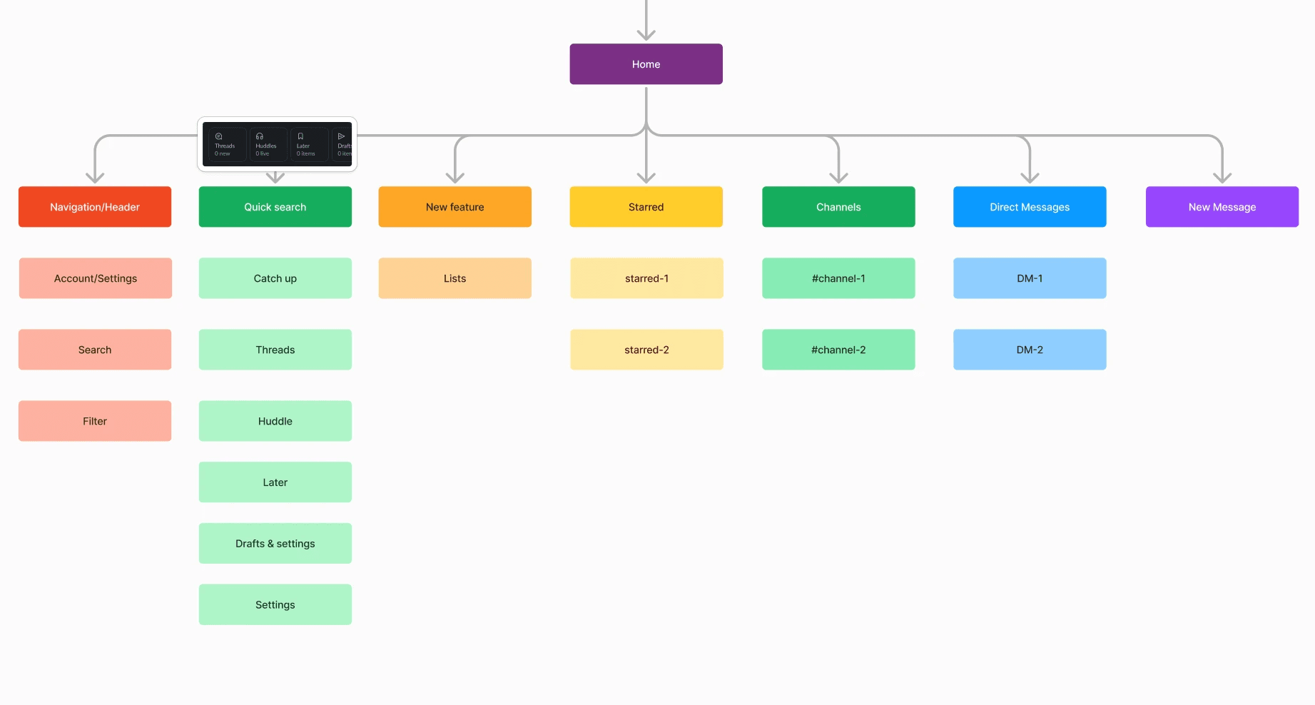
INFORMATION ARCHITECTURE
Understanding Huddles in Slack’s Navigation Structure
To understand where Huddles currently sit within Slack, and how users interact with them, we mapped out the existing information architecture using FigJam.
This helped us identify:
Where in the interface users can access Huddles
How deeply integrated Huddles are with other features like channels and direct messages
Whether the hierarchy and structure support discoverability and effective use
We found that while Huddles are accessible, they aren’t always easy to locate or initiate from the home screen. This confirmed our focus on improving discoverability and creating smoother, more intuitive entry points for starting and scheduling Huddles.
IDEATION
From early ideas to a shared vision
With a clearer understanding of the challenges, we jumped into ideation using multiple creative frameworks in FigJam to rapidly explore possible solutions:
Mind Map
We visualized the full Huddle experience, expanding on touchpoints, pain points, and opportunities. This gave us a broad landscape of ideas to work from.
View Mind Map
Crazy 8's
We quickly sketched eight different solution ideas in just a few minutes, encouraging volume over perfection. This method sparked unexpected directions and variations.
View Crazy 8's
Brainwriting
Each of us worked individually in FigJam, adding ideas in parallel. After a few rounds, we came together to review and discuss the most promising directions.
View Brainwriting
This fast-paced and collaborative process helped us unlock a wide range of directions to explore further. From these early concepts, we aligned around a clearer scheduling experience as our core direction.
USER FLOWS
Mapping our flow – and refining it along the way
To better understand the user journey and identify pain points, we mapped out both the current and proposed flows for scheduling a Huddle in Slack.
The current flow revealed that the process is informal and lacks guidance, requiring users to coordinate manually and rely on luck for participation.
View Current Flow
In our proposed flow, we introduced scheduling features that let users plan Huddles ahead, select participants, and add context like agenda and timing.
View Proposed Flow
We used the improved user flow as our starting point and continued building on it as new ideas emerged throughout the process.
WIREFRAMES
Low-fidelity explorations to refine the flow
After finalizing the improved user flow, we moved into lo-fi wireframes to define the structure of our solution. Although the final number of screens was limited, this step was far from superficial.
We created wireframes to map out the essential structure of our solution. Even at the wireframe stage, we spent time refining the flow, discussing different ideas, reworking screens, and making sure the experience felt smooth from start to finish.
While the wireframes weren’t overly detailed, they allowed us to test our assumptions early and align as a team before jumping into visual design.

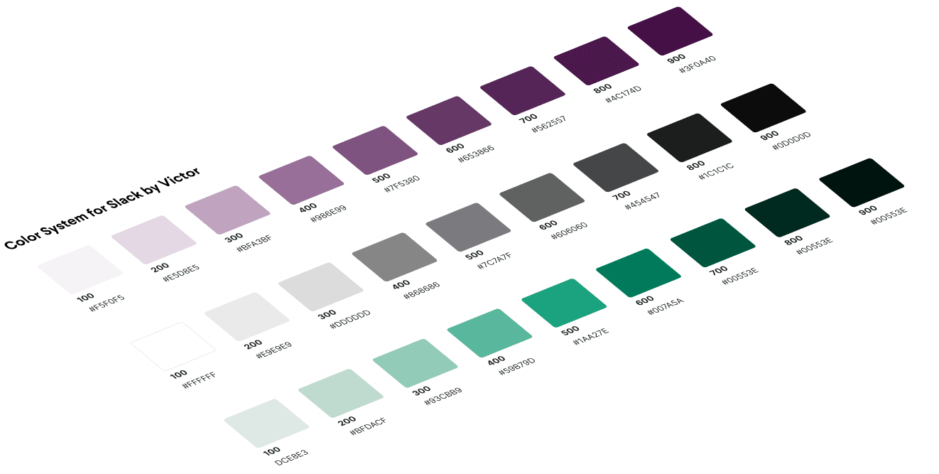
UI STYLES
Staying true to Slack’s visual identity
Once we felt confident in our wireframes, we began defining the visual styles: colors, typography, spacing, and grids. Our goal was to mirror Slack’s design language as closely as possible.
We dissected screenshots from the original app to match everything from padding to text sizes and button shapes. It was a detailed process, but also a rewarding one, resulting in a design that felt both familiar and functional.
HI-FIDELITY PROTOTYPE
Bringing the experience to life in every detail
With our styles locked in, we moved into high-fidelity prototyping. Our goal was to build an interactive experience that felt polished and intuitive, making it easy to click through and understand the concept quickly.
We focused on the home screen first, showcasing the new entry points for Huddles and the streamlined scheduling flow. The rest of the prototype followed, with special attention to clarity, usability, and microinteractions.
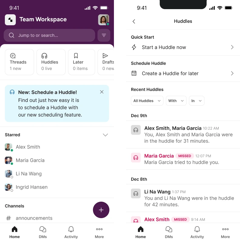
HI-FIDELITY PROTOTYPE
From pixels to prototype
After aligning on a scheduling flow and visual direction, we built a high-fidelity prototype in Figma that captured both the functionality and feeling we wanted for Huddles in Slack. The process involved multiple design iterations, testing, and refinements to ensure clarity, ease of use, and alignment with Slack’s mobile UI.
The prototype reflects everything we had learned—from user needs and interaction patterns to spacing, hierarchy, and tone. It became our way of stress-testing the concept and visualizing how the experience would come to life on iOS.
This prototype isn't just a showcase of visuals—it's a demonstration of design craftsmanship. From static mockups to a fully interactive experience, every element was carefully built to feel native to Slack’s iOS app. All carefully designed to support real-time collaboration on mobile devices.
VALIDATING THE SOLUTION
What Maze testing told us
To test the usability of our concept, we ran a remote Maze test with 25 participants. They were asked to schedule a weekly Huddle using our new interface.

Heatmap from Maze usability test showing where users clicked when scheduling a Huddle.
To test the usability of our concept, we ran a remote Maze test with 25 participants. They were asked to schedule a weekly Huddle using our new interface.
The results were encouraging:
76.5 % completed the task successfully
The average task time was just over 85 seconds
Most users rated the experience 4 out of 5 in terms of clarity and easy
Feedback highlighted both strengths and opportunities:
Users found the invite process simple and visual
Some struggled to locate the Huddle button initially
A few noted that adding a meeting name or seeing calendar conflicts would improve the experience.
Since this was a Figma prototype, certain interactive elements, like text input or dynamic feedback, weren’t functional. While we noted in the test introduction that some features were limited, we could have communicated that more clearly to avoid confusion or misplaced friction.
These insights confirmed that our direction resonated with real users, while also revealing opportunities to improve clarity and reduce friction, especially in entry points and time selection.
CLOSING THOUGHTS
Reflecting on the process
This case study taught us a lot, not just about scheduling workflows in Slack, but also about navigating team collaboration and iteration in a tight timeframe.
We’re proud of the final result, and it reflects a real effort to think through a user problem, explore different solutions, and bring something tangible to life.
BEYOND THIS PROJECT
Ideas we didn’t have time to build, but would love to
One idea we explored but didn’t implement was a smart AI follow-up feature. The concept was simple:
After the Huddle ends, AI analyzes the recording and provides all participants with the meeting summary and action points.
This would have added real value for teams juggling multiple projects or working asynchronously, but we simply didn’t have time to include it in the final delivery.